kustom watch face
klwp allows for endless customization of the android interface. More amazingly, once one becomes familiar with the tool, it is easy to trial changes in an iterative fashion.
With the blank background of my particular wallpaper, it didn’t take long to decide to put a new face to the big black void.
Enter..
gearbox
which adds a watch face to the segments of the analogue clock..
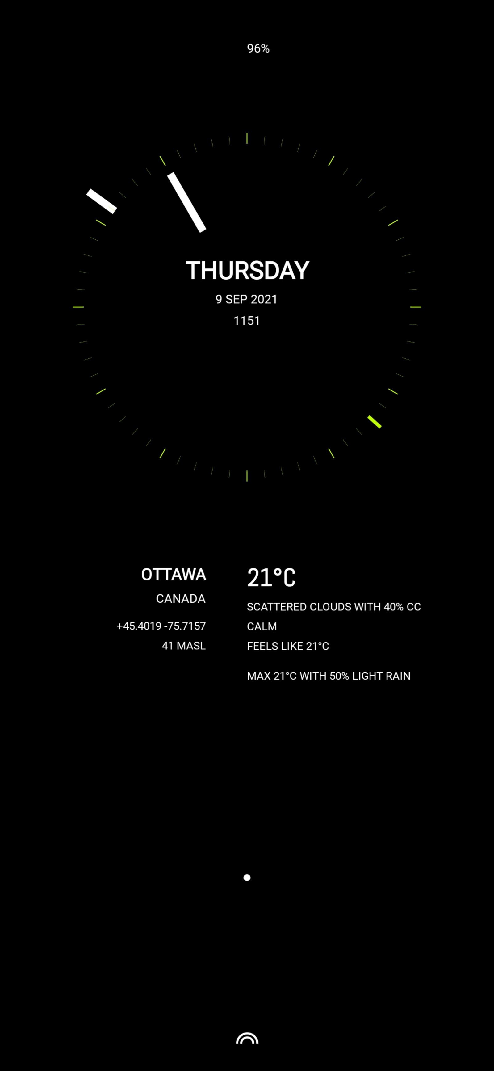
The geometry of the wallpaper remains the same with minor tweaks to the minute hand—width matched to the hour hand—and the second pointer—arrowhead changed to a bar slightly longer than the “tick” marks.
The effect is discrete yet balances the minute and hour hands which previously hung out on the blank background with a varying visual impact. The overall effect is a more classical watch face, though, without the traditional long hands.
orbital
separates the minute hand from the tick marks. But instead of placing it in the orbit of the hour hand, moves it further out onto its own..
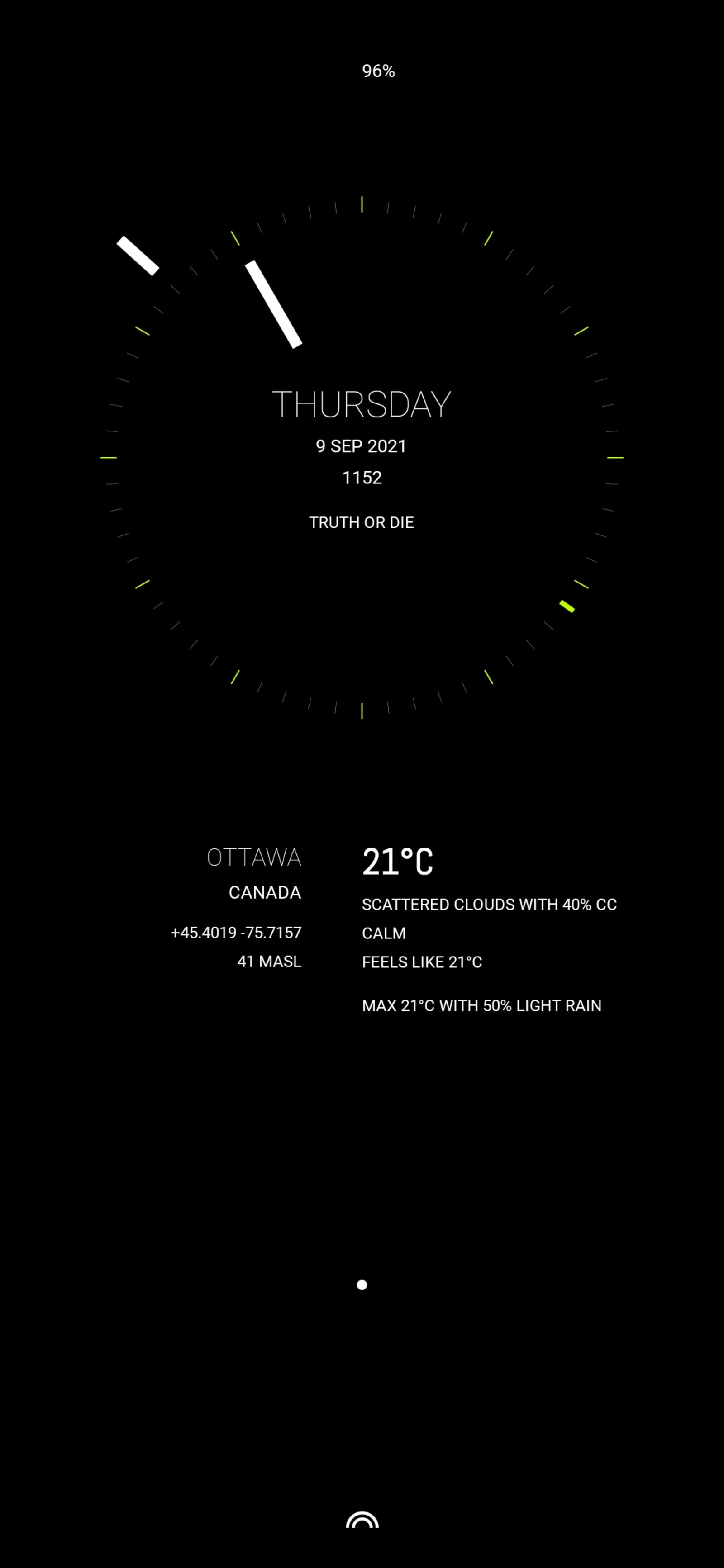
Further refinements to the font for the day of the week and the city, make the watch face stand out more clearly—whose hour hand previously competed visually with the bold text at the 10 and 2 o’clock positions and to a lesser degree at the 6. As a Canadian forever obsessed with our changing and extreme weather conditions, the current temperature retains it bold status—adding a hint of visual dynamic to an otherwise symmetric design.
It feels a touch more elegant—the power of the font—and i, today, prefer the “read” of the minute hand orbiting the tick marks. There is an added symmetry when the minute hand is opposite the hour hand.
“Today” is the operative word. i suspect that it is not unusual for klwp users to be constantly refining their Android wallpapers.. or giving their phone a complete make over from time to time in search of that elusive end game. Or just because. :)
planetary
well, tomorrow came and went. With it, substantive changes to the positioning calculations of the clock components so the clock scales properly while adjusting the custom KLWP global clock variable values. Once done and Orbital was tweaked to satisfaction and saved.. it was time to play some more and be creative.
With some simple adjustments—calculation simplifications in this case—and shape changes to Orbital..
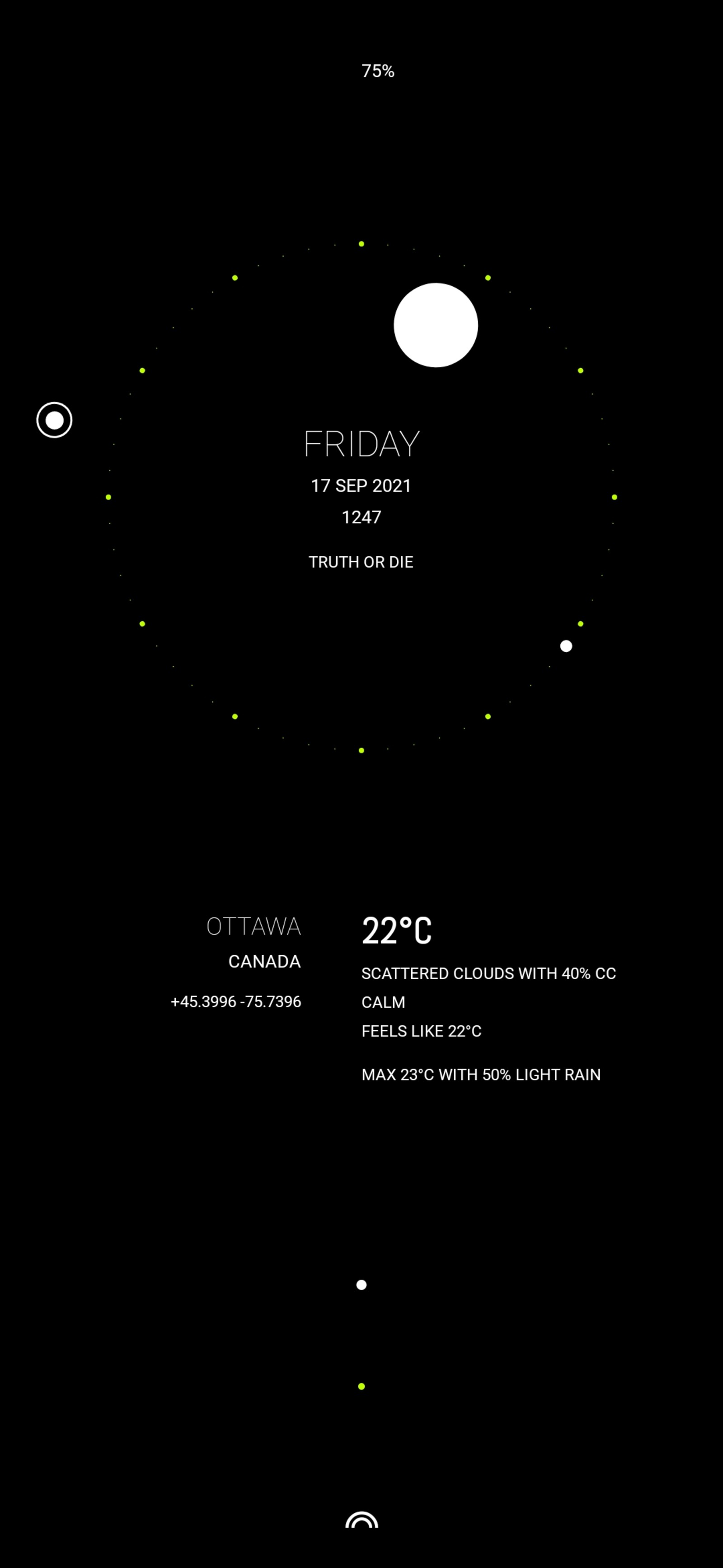
Planetary abandons the traditional clock hands completely with circular shapes yielding a pleasing animated abstract design.. that happens to also be a clock, completing the rounded emphasis of the wallpaper.
It was just a playful experiment that grew on me immediately, so is today’s face on my Android phone. No doubt, with further orbit variations to come..
2001
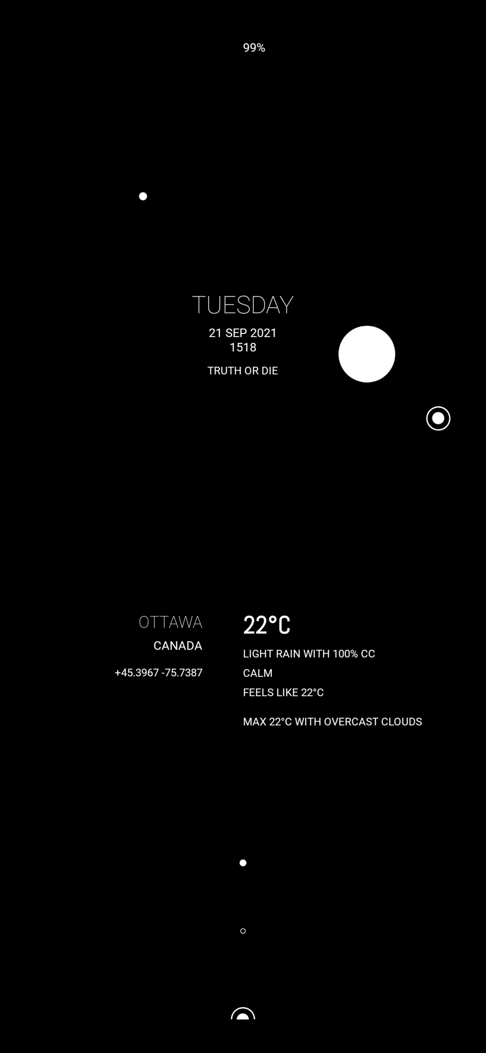
..Homage to Kubrick’s 2001, by adding a togglable clock face with bright, dim and invisible modes and smooth clock movement for that pure faux orbital sim :)
2010
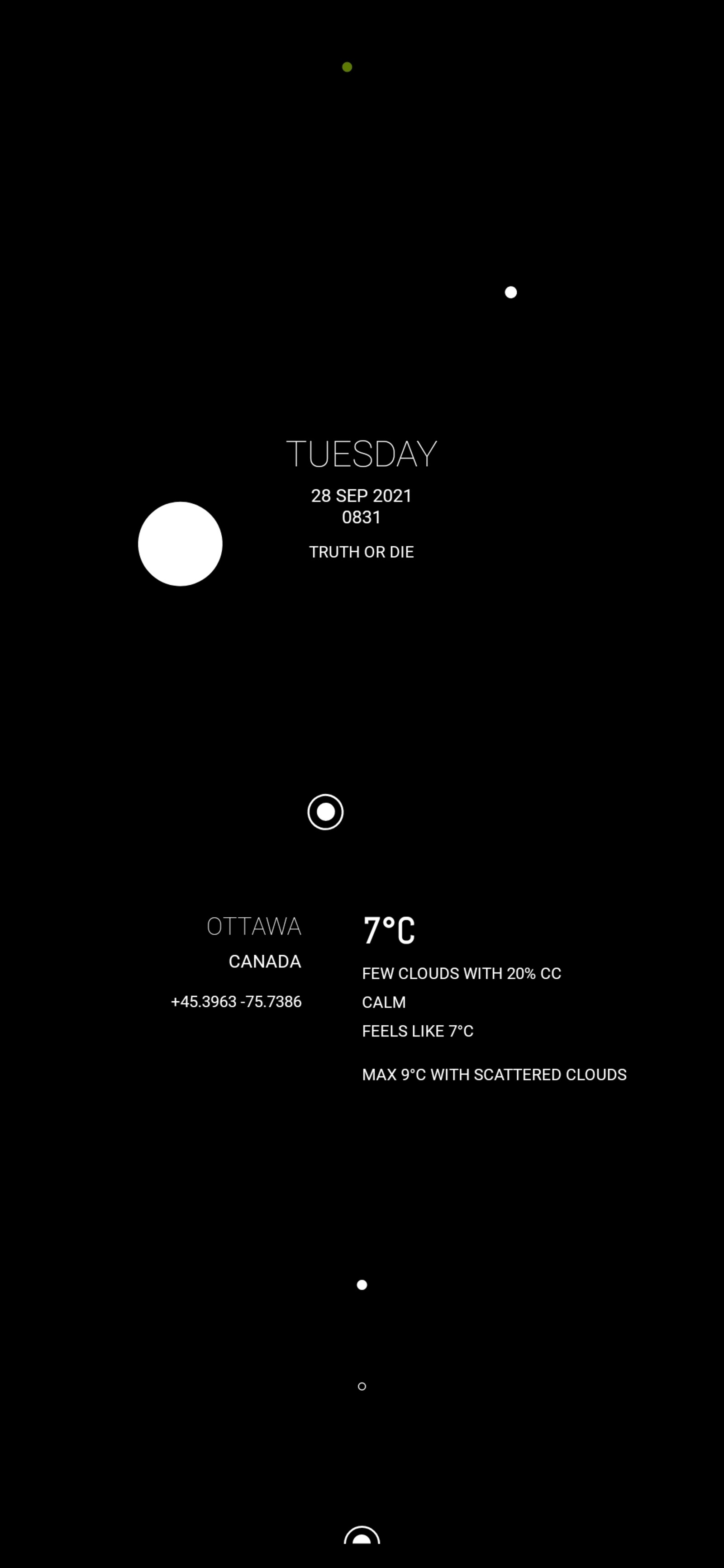
Colours were dominant in the sequel to Kubrick’s iconic movie. In keeping with the celestial theme, the battery percent has been replaced with an orbiting coloured (to separate it from the clock orbits) gauge. 0 percent at the 10 o’clock, 50 percent at the 12 o’clock and 100 percent at the 2 o’clock positions, moving counter clockwise—albeit, imperceptibly.
As a further visual aid, the orbit dims as the battery drains. A global switch sets whether the orbit brightens on charging or is replaced with the previous battery charging information panel.